The welcome email is an incredibly important message type all brands should be leveraging. Welcome emails can be easily automated, and see some pretty awesome metrics:
- Up to 82% open rates.
- 3x the revenue generation over regular marketing emails.
- 5x unique click rates.
As a result, we highly recommend that these be included in every email marketing strategy.
Implementing welcome emails into your marketing strategy is easy. These kind of messages allow for some wiggle room too. You can set them up to send once someone fills out your signup form, or you can have them set up to send to new customers who may have skipped the opt-in step and went straight to the purchase.
To help marketers build their welcome emails, we’ve put together some custom messages. These welcome emails follow design best practices and can be easily replicated.
Best Practices for Welcome Emails
A few notes on best practices before we dive into the design templates. For starters, if a shopper’s signup was incentivized (a highly recommended tactic), make sure their checkout code is prominent and easy to copy in the email.
And while some may want to just drop in that checkout code, don’t be afraid to make your welcome email a mini shopping experience. If someone has subscribed through an incentivized signup form, they likely have a high intent on buying, so make sure you include some popular products in your message to help them along their journey to purchase.
Examples of Welcome Emails
These examples are from fictional brands created for Springbot’s library of email design lookbooks. The lookbooks include designs for messages such as cart abandonment, gift guides, seasonal sales, and other promotional emails. Additionally, they contain inspiration for other channels like ads and SMS. You can see our entire library here.
And now onto the Welcome Email designs. These designs were created using email best practices, and can serve as an inspiration for not just the creative aspect, but for the copy as well. These designs are presented by
1. Food & Beverage
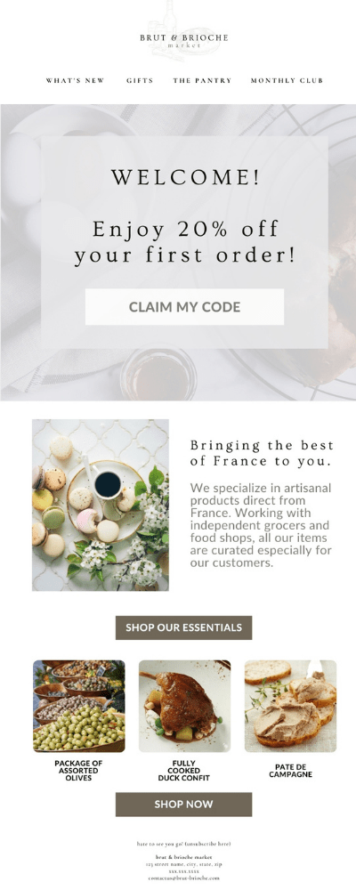
With a prominent checkout code and product offering, food and beverage retailers can really maximize their welcome emails.
2. Home & Furniture
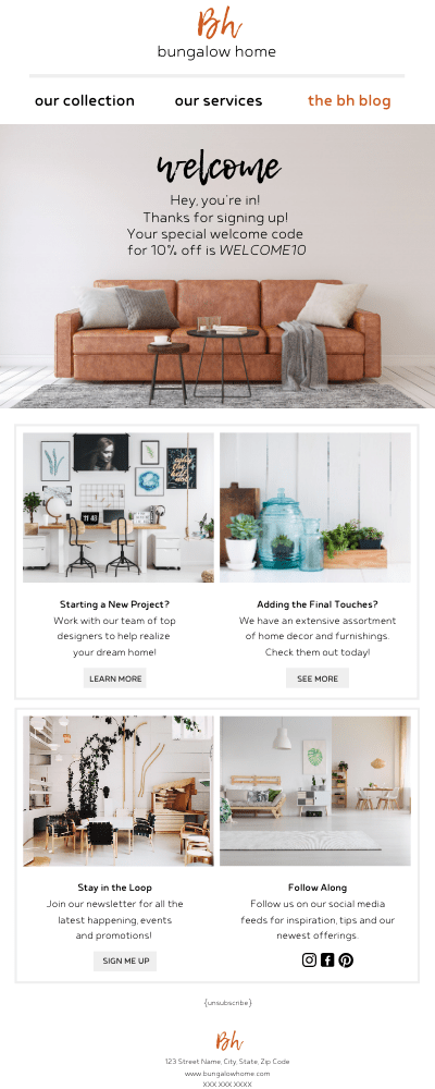
Retailers specializing in furniture and home goods can see immediate value with welcome emails by leveraging them to really show off their wide array of product offerings.
3. Health & Beauty
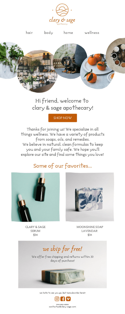
With a wide variety of offerings, health and beauty online retailers should really try to create a mini shopping experience in their welcome emails. But be sure to keep it neat. An email with too much going on can cause a negative reaction for readers.
4. Home Decoration
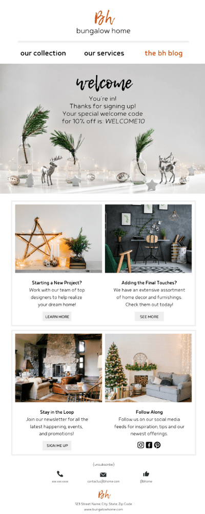
While welcome email automations can often be left on auto-pilot, it’s important to check in every month or quarter to see if the automation or the email needs to be updated. For instance, this example for a Home Decoration store was adjusted for the holiday season – showing off the store’s seasonal offerings and making the welcome email appear more timely.
5. Skincare
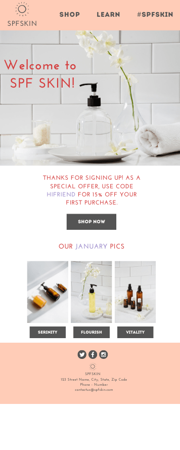
Don’t always feel like you need to load up your welcome email. Sometimes the code, minimal text, and product displays are enough to encourage the shopper to buy while staying true to your brand.
6. Child Goods
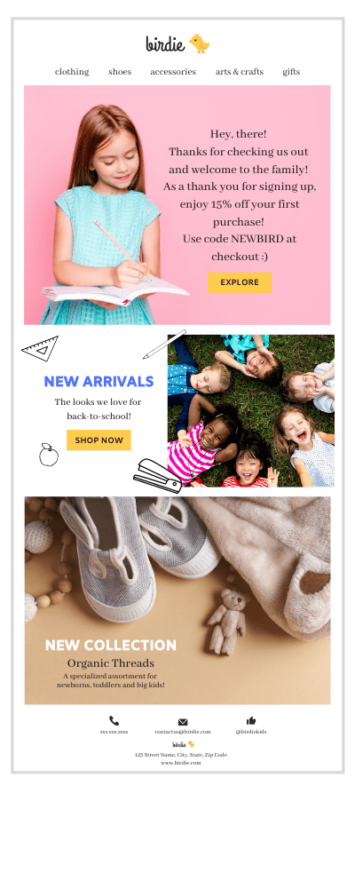
Lastly, don’t be afraid to have fun with your emails. These message are aimed to drive a purchase first and foremost, but they should also represent what your brand is as well. Aside from brand colors, consider using the welcome email code as another opportunity to show off what your brand is all about.
Optimize Your Email Channel With Springbot’s Welcome Email Automation
Automations are a marketer’s best friend. And with Springbot, growing businesses can depend on Springbot’s suite of marketing automations – which span from welcome emails to cart abandonment, to even SMS automations. These automations help brands connect with customers at the perfect moment.
If you’re interested in learning how Springbot can help you, click here and shoot us an email!

