So, you’re building an email? A custom design can be at first intimidating, but with the proper tools and planning you’ll be developing exciting and revenue generating emails in no time.
A few important questions to consider to get your creative juices flowing:
- Think about the email’s fold. What is most important for your customer to see first?
- How can you visually draw the eye down the email?
- Did you include relevant CTAs where applicable for easy touchpoints and action?
- Trying to make your email more robust? Can you add social media call outs, newsletter signups or recommended products to make the email more varied?
We incorporated many of these elements into our own email examples for the 2019 Summer Email Design Lookbook. (Want a quick download? Click here.)
Here are a few more best practices to help guide you as you begin to design your emails.
Let’s Talk Brand Guidelines
It’s important to establish and stick to a brand identity and aesthetic. It’s easy to get swept up in the creative and forget your company’s roots. It’s always best to use personal, branded imagery. iStock and image libraries are great tools to keep in your back pocket, but ultimately your own imagery is best. Instead of shoehorning seasonal looks, look for ways to make seasonality compliment the brand you’ve established.

How to Leverage Text Overlays and Imagery
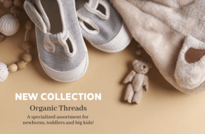
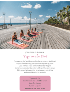
Using images as backgrounds can be much more visually interesting than just a blank or solid color background. Incorporating text overlays which flow with the image can really make your emails standout. (Springbot’s new email editor makes inserting text overlays easy.)
Your choice in image is important. Avoid choosing “busy” images – ones with too much going on – as these can be too distracting, and often make the text hard to read. You want to look for something where the text and imagery don’t compete.
The best images will always be the ones you create or take yourself. For product images, iPhones and other mobile devices can make taking pictures really easy. There are also a ton of free apps and programs to enhance your images easily, making it look like you hired a professional photographer!
Flat lays are a great way to capture imagery on your own. Simply lay down a piece of colored paper, arrange your product nicely and take the shot overhead. You also don’t have to worry about any compliance or royalty issues when the images are your own. When your product speaks for itself, show it off!

The Importance of Color, Font and Copy
Color is a great way to add some pop to your messaging. Try playing with bright and colorful text, CTA links and borders. You can also bring a seasonal theme to your email with color. For example, in the summer, working with vibrant colors such as blues, yellows and pinks can really drive the seasonal message home.
Additionally, font is another tool that can bring an email to life. It’s important to have a brand font for consistency and identity. Many brands will choose both a serif and sans-serif font option for more flexibility and variety.
Copy is also key to your email’s success! Keep in mind your email’s topic and intent. Too much copy can deter a reader and quickly make them bounce off the page. Proper balance between text, imagery and CTAs will ensure a healthy and thriving email campaign.

Feeling better about the process? With just a few design considerations and additions, your email campaigns will really pop this season. Get inspired by the holidays and summer activities.
Stay authentic to your brand, experiment with text overlays and imagery, and be creative with font, color and copy!


